April 09, 2020
Designing the RING
Robert Innes Hopkins (Sets)
Johan Engels, the Lyric Ring’s original designer, died in 2014. Sir David Pountney asked Robert Innes Hopkins to pick up the reins because he felt the concept needed to be fleshed out, and also because with a Ring cycle being such a long-term commitment, it’s difficult to hold on to a designer’s vision when that designer is no longer present. Hopkins has shaped Engels’s designs and responded to them in detail through the entire cycle.
The original vision had been to produce a Ring with all the storytelling qualities of good theater. Shows like War Horse had been mentioned, with their use of puppetry, visual manipulation, and staging that showed the mechanics of what you were watching, so that the story would be told clearly. We were producing the big images – dragon, giants, Rhinemaidens, Valkyries – in a way that would allow you to embrace the scale but also embrace how that scale is realized.
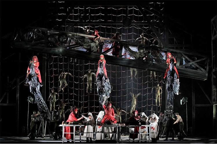
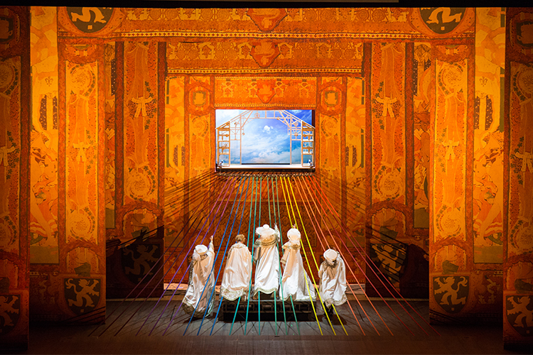
The story is played out on the stage of an old theater, and the characters don’t see the mechanics around them. When you see the horses flying through the air, we want you to embrace the knowing artifice of how it was realized. Through that we end up with something very truthful. David also wants the story repeatedly stripped back to the bare bones, so we start each leg on an empty stage. Alongside that is movement through time, so Rheingold has a Baroque aspect, then we’re into the early twentieth century for Walküre, then we’re close to today for Siegfried before pushing into an imagined future for Götterdämmerung. The red show curtain represents the complex family tree. It’s a tree, but the Norns are forever sewing the red ropes of destiny. This is a large-scale tapestry of ropes through cloth of a family tree. And every major effect involves the “Crew,” a group of acrobats, actors, and dancers, who are energizing the stage, keeping the concept alive.
In Rheingold’s first scene, the Rhinemaidens are moving around on actual refurbished camera dollies that we also use in Walküre and Götterdämmerung. Their choreography has been very carefully worked out for moments when they swoosh in front of each other. It was done at a slow speed during the rehearsals. I love their three-dimensional movement. Even when they’re seemingly just resting, they’re just gradually bobbing up and down as you’d do if you were in water.
The third scene, in Nibelheim, presents three elevators which, when fully in their “up” position, are a cube. We use them throughout the four operas. In Nibelheim they’re like pistons – beautifully made pieces of equipment that move hydraulically so we can program sophisticated patterns across the three elevators. It makes the whole thing feel kinetic and hot, like being in the engine room of a giant steamship.
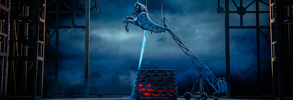
The “World Ash Tree” for Walküre suspends over the stage. It’s got a wonderfully threatening quality to it, but also a sort of stasis. In the model it was a real piece of wood, but what we have onstage is steel and laminated Fiberglas. The catwalk-like Valhalla bridge is on several motors – it’s an enormous piece. It’s very secure, although obviously it has a bit of movement on it. There’s a secure handrail to hold onto.
In Act Three we’ve got three horses on dollies for the “Ride of the Valkyries,” and in the finale the fire is done with 19 fire sticks, all independently remote-controlled. The movement choreographer has created a beautiful “ballet” of firesticks. It’s our stage crew that creates the ring of fire. We didn’t have any appetite to use real flames. We do have an LED screen, so we can project quite high-intensity flames as well, so we get the flames realized with a sense of movement from the screen.
In Siegfried, we’ve been faithful to Johan’s idea of a little boy’s playroom (the paintings on the back wall are directly from his model). My creativity in that scene is all the stuff that arrives onstage – the anvil, all the aspects of the foundry, Mime’s grungy chemistry set.
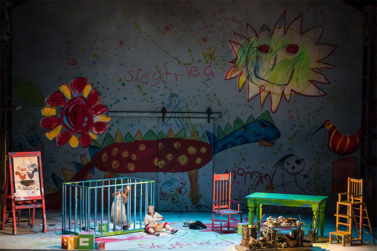
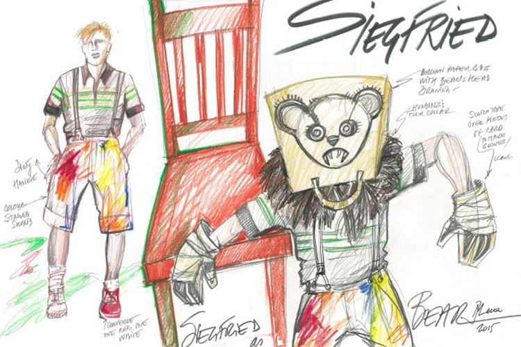
We wanted the Siegfried forest to live out of the floor (in Johan’s design there were inflatable trees, but they were just too noisy). The dragon is my design, based on Johan’s, which was much bigger. The dragon is inflatable as well.
The Siegfried/Brünnhilde scene that closes the opera is between two people communicating with each other while also experiencing internal thoughts and internal dialogue, some of it very vulnerable, almost childlike. They’re turning inside themselves and their own minds, returning to their own safe space, their childhood room, and then they grow back out again. So, of course, in this scene the “adult child” quality with which we start the opera is revisited, with the balloons representing a sense of childhood optimism and wonder.
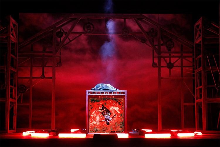
Very important in Götterdämmerung is the “snow cloth” in Act Three. Siegfried has gone hunting, and it’s a snow landscape. He will be killed on it, and there will be a big red stain. That disappears into the floor, replaced by the funeral pyre. We have a front video projector, and we use it on the front cloth. We use more contemporary stage equipment as we move through time. So we can project snow, but we’ll also have snow falling from machines as well, and we’ll keep it snowing through the scene.
I designed the funeral pyre, which didn’t exist in Johan’s design. We had the Valhalla wall rebuilt for Götterdämmerung. We recognize it from the previous operas, but it’s in a state of immense disrepair. We’ll have smoke coming out of it. The video projector is powerful enough to project the flames onto the wall. Combined with smoke coming out from various parts of it, it will look amazing! The cycle is going to end up exactly where we started -- we go back to the blue silk of the Rhine.
Marie-Jeanne Lecca (Costumes)
I remember from my initial discussions with David Pountney that, having chosen to set everything inside a magic black box, we started with an empty stage and finished with an empty stage. Within this framework, it was important to show the theatrical elements that help tell our story.
I began my preparation by reading the libretto and doing my own research on text and images. I read the Norse sagas and watched some films, including Ariane Mnouchkine’s Molière, Julie Taymor’s Titus Andronicus, Patrice Chéreau’s Bayreuth Ring, and John Turturro’s charming Illuminata, which takes place in an empty theater. After the research come the sketches and drawings. I try to be quite specific with them – the composition of the page becomes a narration.
It was important to give each opera its own style, while at the same time retaining a certain unity within the cycle. Within the idea of a theater framework, there is a passage of time, but not a realistic one. We’re never firmly in a specific period. You want that freedom – it shouldn’t be set in stone! The Ring is like one huge opera in four acts, and having certain characters working their way through the whole cycle creates a powerful link. The passage of time needs to be felt, because it has to move toward the future.
In proceeding through the Ring operas, certain fabrics have been particularly appealing and helpful. I was lucky to have fabrics treated especially for this Ring. For example, Alberich’s coat was made out of a printed fabric with coins printed on it in different sizes. For the 3-D effect we’ve sewn coins on it, in addition to the printed coins, so you create a very strong effect like gold.
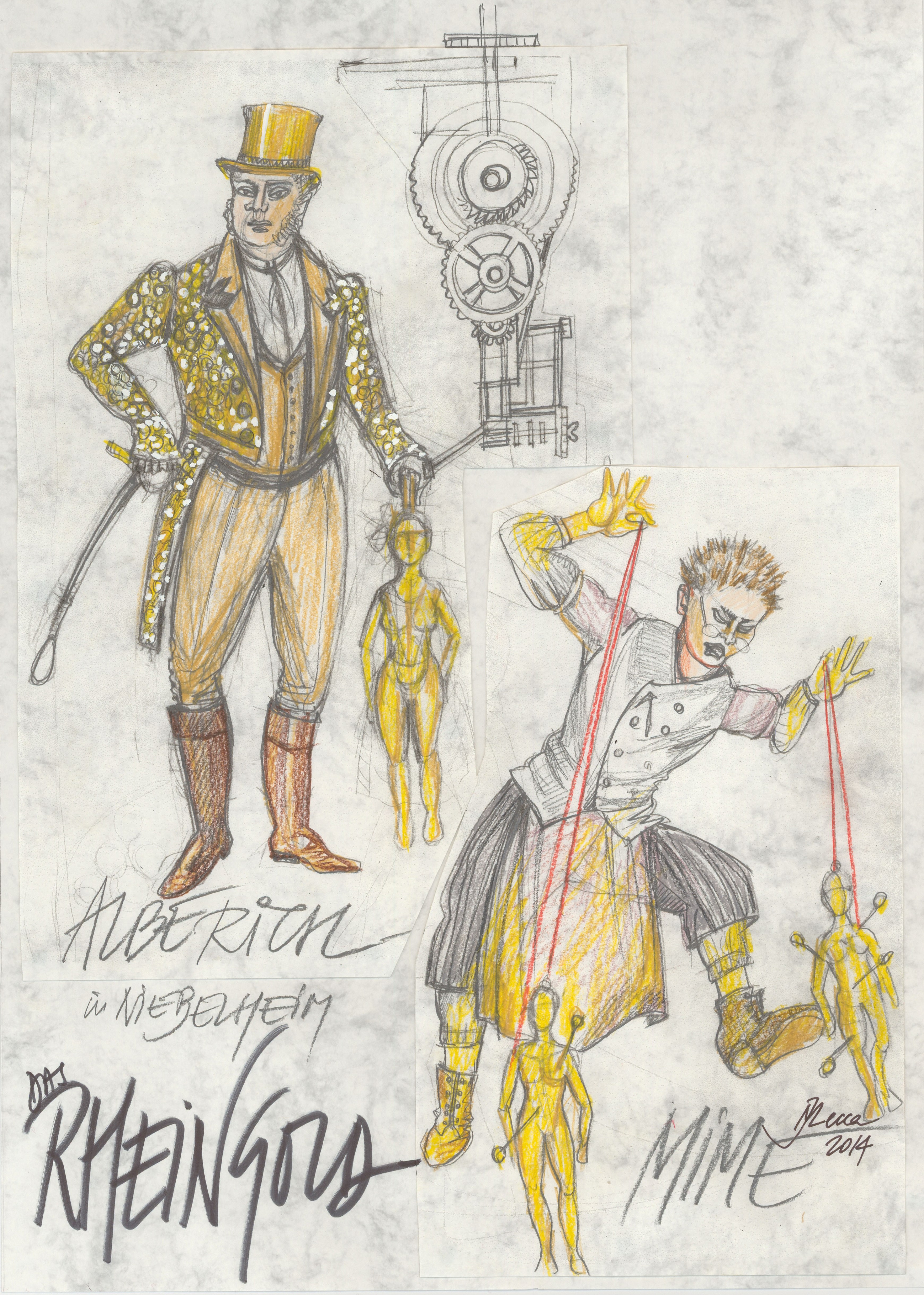
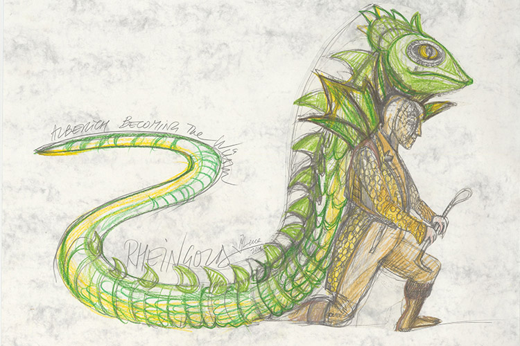
In Das Rheingold, the late eighteenth-century look was inspired by the Mnouchkine film, with its troupe of touring actors. Alberich’s lizard and frog costumes are inflatables that look like they’re coming from Alberich’s body, made out of fabrics that allow for this treatment. They need to be fun, and at the same time spectacular! They have to take us visually to the Siegfried dragon, which is inflatable too.
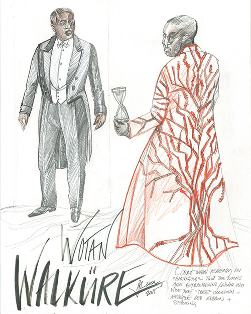
The Ring costumes move forward chronologically from late nineteenth century to early twentieth century. In Die Walküre there’s a war going on – the Valkyries are warriors on a battlefield – and we thought of non-specific 1940s as the most appropriate setting. Everything, including Wotan’s tail coat, is from that period.
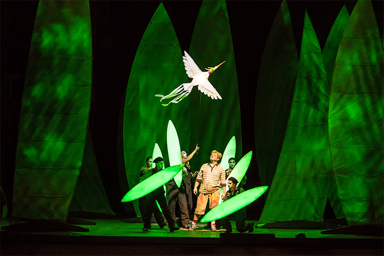
Of course, the color palette helps to define the world of each opera. Rheingold has a lot of warm red and burnt amber, but Siegfried is the most colorful of all. Siegfried is a naïve boy fighting his way into the world; he’s in short trousers with short hair. Wotan has cast away his Walküre coat and is now the Wanderer – just a spectator. Brünnhilde sheds the layer of a warrior and emerges as a young woman who will change through love. We wanted the Forest Bird to be both fun and sweet. For her, the obvious image of the 1960s would be Twiggy, so that’s what we based it on, because of the colors. If you think of the progression of the production in time, after the late eighteenth century and the 1940s, this would be the natural progression, looking at the set as well.
Götterdämmerung is taking place in the not-too-distant future – the decline and fall of the gods. We have to have the promise of birth at the other end. It’s Hagen and Gunther’s world, with a great deal of black and some reptilian elements, like Hagen’s costume. I’m using a fabric that has textile scales on it. It’s the first time we see the chorus in the Ring, and it’s not an independent-minded population – they’re vassals of Hagen and Gunther. There should be something clone-like about them, and they’re in very dark colors with a lot of silver.

Fabrice Kebour (Lighting)
When I hear the first notes of Das Rheingold, I always see a distant fog. It’s so far away, coming from darkness, and then it builds incredibly. When we move to the next scene, that’s when the world opens up visually – a second step into discovering the space.
Valhalla needs a powerful light when the gods arrive. A strong back light starts buffing the whole stage, which is when we discover the architecture, the wooden frame. A brilliant, silvery/white light is present almost throughout the first Valhalla scene.
Going from Valhalla to Nibelheim is tricky: the further Wotan and Loge descend, the more we start feeling the opposite of Valhalla. For Valhalla we have a bright light coming from far up, but for Nibelheim most of the direction of the light comes from the floor. There’s a gold tint in Nibelheim, which is actually a very incandescent light, contrasting with the strong red that makes it feel like it’s gold.
Smoke is a fantastic element to work with when used properly. In Die Walküre I wanted it for showing the hostile world outside. There’s a brutal light coming sideways from only one direction, feeling like there is drama – a storm – approaching.
In Act Two it’s challenging to light the bridge and separate the two worlds. Our idea is that Wotan is watching from Valhalla, and it’s important to create this distance. I keep the silvery white color for Wotan and try to make the bridge’s architecture powerful, making sure none of that light lands on the floor.
For the Valkyries’ ride in Act Three, they’re standing on cranes pushed by technicians, so you have a fine line between creating a world for them where we believe they’re riding horses, but without hiding the technicians and the cranes! It’s part of our concept that we don’t hide the tricks, but the horses and Valkyries had to stand out more strongly than the technicians. I keep it like a black-and-white movie with very strong direction and strong shadows. The magic fire is done with tubes that light up and are manipulated by the dancers. I’ve made those sticks musical, cueing the whole fire sequence so that the fire is literally breathing, sometimes becoming bigger, all done with those sticks and with some projections on the video screen.
Siegfried needed a totally different aesthetic. It’s a fairytale world, seen through a child’s point of view. I want the colors in Siegfried’s room always to be primary. That’s true in Act Two as well – the forest, which is also a child’s image in a very naïve world. It’s only at the beginning of Act Three, with the Wotan/Erda scene, that we return to an adult vision and don’t see things through Siegfried’s eyes. Going back to the world of Wotan means lighting in a more severe way, giving a cold atmosphere. For the final scene, with Siegfried’s and Brünnhilde’s rooms, when the singers are moving between those rooms, they’re lit, but I don’t open the space as one could have done – I want to keep the intimacy.
Götterdämmerung is yet another world, stepping into a futuristic society, very black-and-white, with visible scenic elements that create a sense of people being watched all the time. For the final scene, I see solitude and a huge, empty landscape, one unique powerful light, and people walking in it casting long shadows in a procession. The contrast with the fire at the end will be very strong. The bridge comes back down and I’ve placed a lot of light on it and on the pyre. We must complete the circle, so the last image has to be like the first one: we have to go back to the Rhine so the world can be peaceful.
Edited from interviews with Roger Pines.